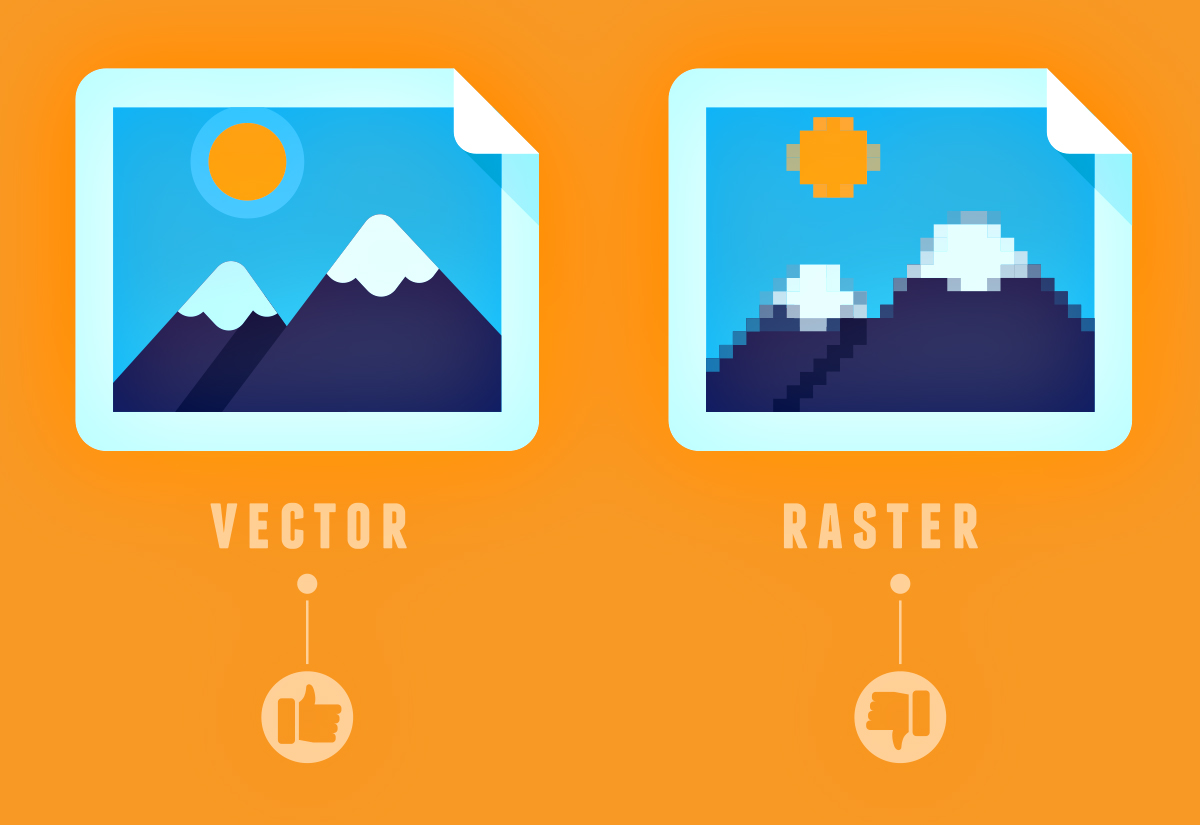
Blurry image? The difference between vector and raster
When it comes to websites, a common question we hear is “why do some images look more blurry than others?”
There’s not always a singular and easy answer to this question, but it helps to have a basic understanding of the difference between the two major image files that are used in designing and developing websites — raster images and vectors.
Raster images
Raster images are perhaps the most common form of image files developed with websites. Raster images are comprised of pixels (each pixel is a single point and smallest element in a digital display, like a computer monitor) and are more complex visuals than vectors.
Photographs are raster images because they use an tremendous amount of of color variations and require the use of pixel limits to optimize the photo. If you think of a sunset image where the sky blends from blue to orange, this is a good example of of a raster image taking advantage of pixel capabilities to present a pleasing website visual.
A raster image viewed in digital form will always have a specific number of pixels when displayed. When you enlarge the image file without increasing the number of pixels, the image will start to look blurry.
Common types of website raster images include jpg, gif, png, psd files.
Common types of images you may see as a raster images:
- A sunset (think color variation/blending)
- A portrait (think facial details)
- Action/Sports (think of complex color transitions and detail)

Sunset (raster)
Vector images
Vectors are a series of lines and shapes. When you zoom in on a vector it will not lose its quality because the composition does not rely on pixels. So it will look great big or small.
When you have an image that has very refined edges and you want sharp contrasts between elements, like a logo or drawing, a vector works better than a raster image. However, vectors can’t handle details and color transitions like a raster can.
Common types of vector files include ai, svg, eps, pdf.
Vectors are better formats for:
- Logos and icons
- Drawing effects
- Sharp lines and contrasts
- Illustrations with geometric shapes (think circles and squares)

Summary
So is the answer to “why do some images look more blurry than others” always related to the determination of whether a raster file or vector is the better fit for a website design? No. But it can be.
There are many other influencing factors that could alter the way an image looks once its online, including:
- Original image isn’t great
- Image resizing and resolution
- Image compression
- Color formatting
- Browser resizing
- Monitor/browser limitations
- Content Management System automations
If you are looking for a very detailed and thorough instruction of image optimization, check out this article by Google.


